My Work

UX Design • UI Design • UX Research • Pre-Launch
Providing Actionable Answers to People with Chronic Illnesses
UHN OpenLab

UX Design • UI Design • Cross-Functional Collaboration • Pre-Launch
Redesigning a Game for Multiplayer and New Players
Ludera

UX Design • UI Design • Please Email for Wireframes
Centralizing Applications for Daycares and Related Programs
Ontario Public Service

Service Design • UX Research • Class Project
Improving the Elections Ontario App and Website
For a class at the University of Toronto

UX Research • UX Design
Helping Shoppers Find the Deals They Want
Designed for a class at the University of Toronto

UX Research
Assisting Students in Creating Exercise Routines
Designed for a class at the University of Toronto
Improving the Functionality of the Elections Ontario App
Designed for a Service Design class at the University of Toronto
We were tasked to find a way to improve the functionality Election Ontario’s App. We identified current pain points via research and discussion with Election Ontario Staff, and designed features to address these pain points.However, we quickly realized that these features could also live on the current Elections Ontario website. Thus, we designed these features for both the app and the website to maximize audience reach.This project was completed for a 2-week compressed class. This class took place in May 2025 and I worked on this project with 5 other students.
What I did:
Conduct focus group interviews
Service Mapping
Design High-Fidelity Wireframes
Discovery Research
To learn about pain points in the current Ontario voting process, we interviewed a total of 6 participants, in 2 focus groups. I interviewed one of these groups, alongside two of my colleagues.
This is what we learned:
Voters want more information about the candidates they’re voting for
Voters have misconceptions about the voting process (for example, they all think the VIC is required, but it’s not. Many also do not realize that there are multiple ways to vote, outside of in-person voting and mailing in a ballot).
Voters want to feel like their vote matters.
Mapping the Service
We used our research, as well as information provided by Elections Ontario staff, to graph out a service map.We did this to identify the key players and infrastructure involved in the voting process, and identify key opportunities to address pain points.

Design Work
Based on our previous work, we designed two features to improve user education regarding both political candidates, and the voting process itself.
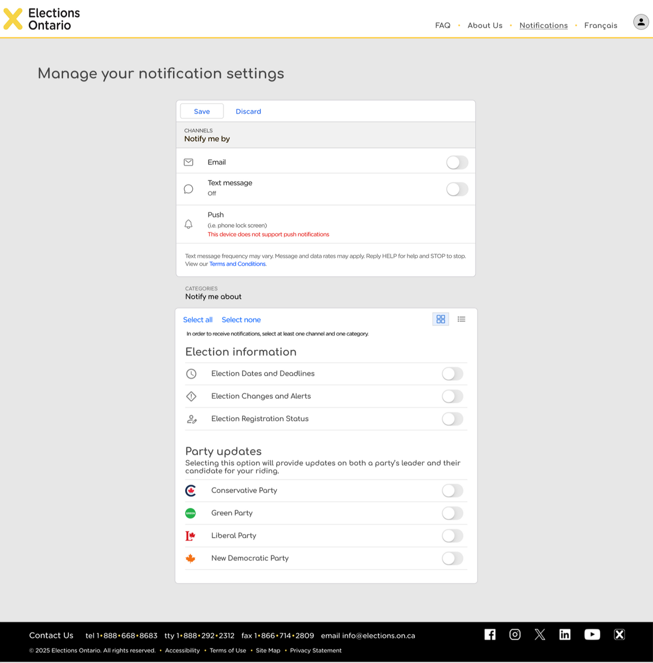
Feature 1: Enhanced notifications
We decided to modify the currently-existing notification system to improve its usability, and its ability to educate voters.
Added options for notifications on candidates and party updates, to facilitate learning about each candidate and party.
Streamlined currently-existing notification options to prevent overloading users
Information about this notification system should be added in highly visible locations (such as the Elections Ontario website) to help users know this feature exists
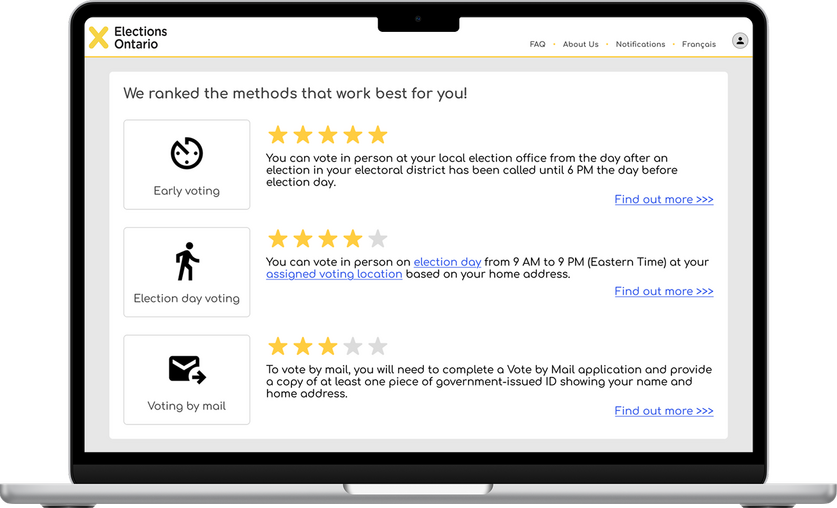
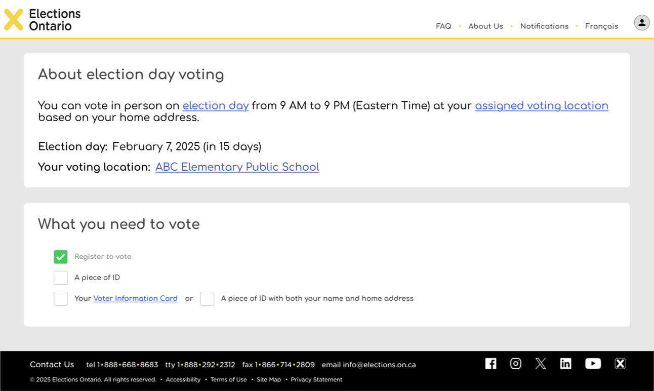
Feature 2: Voting method recommendation survey
After answering a quick survey, users get voting methods recommended to them.
Clicking on each recommended method provides a checklist of what's needed to vote, ensuring that users know what's required for voting.
Results educate users on lesser-known voting methods, and what they would need to provide to vote.
In the future, we would like to add a third feature that shows users their voting history; by doing this, we hope to give users a sense of the impact their votes had.
What I've learned
This project gave me the opportunity to learn and practice a lot of new skills.Some of the most important takeaways I learned from this project include:
How to conduct service mapping and use that to identify opportunities for improvement
The differences between service design and UX design, and the benefits of each approach
View Other Cases

Providing Answers to People with Chronic Illnesses

Centralizing Applications for Daycares

Centralizing Applications for Daycares and Related Programs
Designed for the Ontario Public Service (Government of Ontario)
The Early Years and Child Care portal was created to give parents a centralized place to search and apply for licensed daycares and other child-related programs, and allow daycare operators to easily manage their records and application waitlists.This portal would keep track of parents' applications, and also inform users about the various programs the Ontario government provides.I worked on this project from September 2024 until April 2025.
Key Skills Used:
Desktop and mobile web design
Content writing
Stakeholder management
Collaborative problem solving
Agile methodology
Iterative design
Tools Used:
Figma
Miro
Mural
Please note: there are no screen designs shown displayed in this case study.
To see screen designs associated with this project, please email me at [email protected].
Problem Space
In the province of Ontario, there lacks a proper centralized website to apply for daycare. Many daycare centres have their own website and application processes, and cities with centralized directories often require parents to go to the website of each daycare to apply.This can make the daycare application process tedious, as parents often need to apply to multiple daycare centres because of long waitlists.Similarly, other related programs, such as child care fee subsidy and EarlyON programs (free recreational and educational programs provided for children aged 0-6) are located on other separate websites.This project aims to make a centralized hub for all registered daycare applications, child care fee subsidy applications, and EarlyON programs registrations in Ontario. With the completion of this project, parents can access all the services the Ontario government provides for young children in one centralized website.
My Role
My primary job in this project was to create high-fidelity wireframes that will be tested in alpha testing.This involved the following:
Translating research findings into design guidelines and decisions
Writing understandable labels and content
Collaborating with UX designers, content writers, SMEs, business analysts, and systems analysts.
I made high-fidelity wireframes for the following modules:
Daycare search and application
EarlyON search and pre-registration
Fee subsidy estimator
Dashboard for parents
Dashboard for daycare operators

Design guidelines I followed to cater to parents
Prioritized simplicity and ease of use for the design, as parents are often overwhelmed, and some are not very comfortable with navigating websites
Using simple language when possible, as a significant number of parents do not speak English as their first language
Providing definitions whenever policy-related terminology is used, as many parents are not familiar with these terms
Ensuring the design is mobile-friendly, as many parents find it easier to use their phones when caring for children
Design guidelines I followed to cater to daycare operators
Prioritizing simplicity, as daycare operators are also often overwhelmed
Providing flexibility for operators to customize their applications, as many daycare operators currently have their own application process
Ensuring that the site can automatically update information fields whenever possible, to minimize daycare operator workload
Leveraging multiple-choice selection for data fields, to minimize operator error, and ensure that a French translation can always be provided

What I've Learned
I've learned a lot by contributing to this project, including:
How to balance various user, stakeholder, and legislative requirements
Best practices for form design
How to leverage a design system
The basics of content writing
Stakeholder management methods
View Other Cases

Providing Answers to People with Chronic Illnesses

Improving Elections Ontario's App and Website


Pain point: [Fee subsidy is a process that interacts with various pieces of legislation, which parents have difficulty navigating]
Design decisions made:
Use plain language whenever possible
Provide easily-understandable definitions of any terminology used
Leverage expandable "hint text" accordions to thoroughly explain relevant edge cases
Pain point: Parents are often overwhelmed, which negatively affects their ability to navigate the application process
Design decisions made:
Prioritizing simplicity and ease of use in the design
Using simple language when possible
Using expandable "hint text" accordions to explain terminology that users may be unfamiliar with
Using colour to draw user attention to important pieces of information, such as an estimate of how much they could be subsidized for
Ensure search filters align with the traits that parents search for, to make the daycare search process easier
Pain point: Daycare operators are often overwhelmed, and do not want to have more paperwork
Design decisions made:
[]
Providing Answers to People Living with Chronic Illnesses
Designed for UHN OpenLab
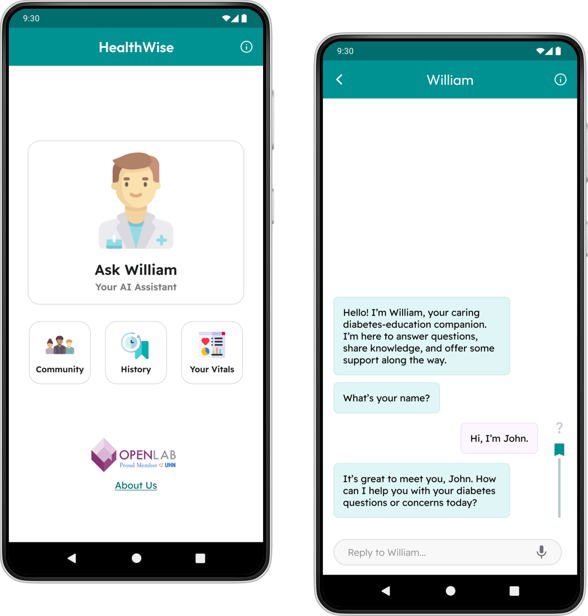
Patients often have questions that arise in between their doctor appointments. We created a medically-trained AI assistant, William, to provide actionable advice to unsure patients.I was the sole UX designer on the team. I worked closely with the project leads, both doctors, as well as the research team that identified the key topics William must be trained on.I started work on this project in September 2025, and completed analyzing this prototype's usability testing data in December 2025.
Skills Used:
Wireframing + Prototyping (Figma)
Usability Testing

Refining the Prototype
Before I joined this project, one of the project leads had created an initial prototype, and ran a usability testing session for it.I was able to access the usability testing data, and leverage it to make the prototype easier to use.
The project leads also requested for various features to be added to the app, to provide a more holistic experience to the patient.Some of the features added include:
An automatically-generated summary of your conversations
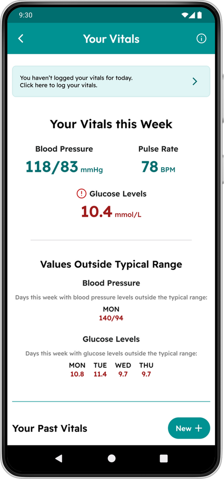
The ability to log vitals daily
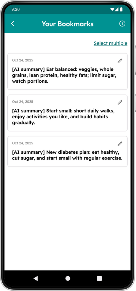
The feature to save messages
The ability to mark messages as confusing
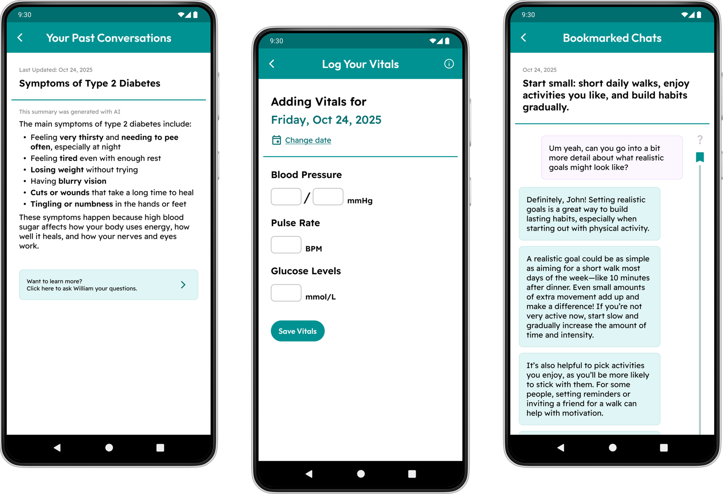
From left to right: a summary of a discussion regarding Diabetes symptoms, the screen for users to log their vitals, and a saved conversation between the user and William.
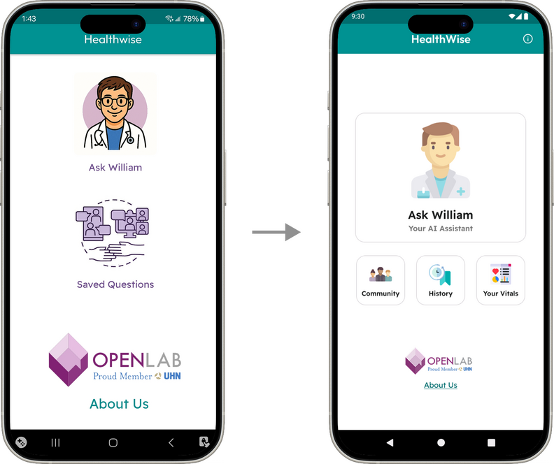
Design Highlight #1
Redesigned Information Architecture and Home Screen
With the addition of multiple new features, the information architecture of the app, as well as the home screen, was redesigned to accommodate the newly added features.
Design Highlight #2
Scannable Log of Saved Messages
Because the saved messages feature often saves multiple messages per entry, a brief AI-generated summary is provided per entry so users can skim each entry and quickly find the ones they want.
Usability Testing
One of the screen with small text
Once the new prototype was polished, a round of usability testing was conducted to check if the redesigned features worked as intended.6 participants, with different levels of familiarity with AI, were recruited for this test.
There were many findings gathered from this testing session, but some of the key findings include:
Concern about text size (especially for older users)
Confusion regarding the feature to mark confusing messages
Lack of confidence when trying to find saved messages
Next Steps
While some time has been spent on this project, there is still a lot of work that needs to be done before it can launch.My next steps for this project are as follows:
Implement the feedback collected from the last round of usability testing
Review copywriting and information architecture to ensure features can be easily found
Create wireframes for discussed but unimplemented features (such as the community features)
Look for opportunities to run usability testing sessions with a variety of actual patients.
View Other Cases
Improving Elections Ontario's App and Website

Centralizing Applications for Daycares

Cleaning Up a Message-Saving Feature
Designed for UHN OpenLab
William is a chatbot created to answer patients' questions in between doctor visits. One of it's key features is a message-saving feature, which lets users quickly find important or useful messages.However, usability testing feedback showed that many users experienced some confusion when navigating all aspects of this feature. As such, it was redesigned to be more intuitive to use.I was in charge of this redesign, being the sole UX designer on the team. I had input from the project leads, both doctors, as well as the patient research team and an LLM specialist. This iteration of the bookmark feature was created in January 2026.
Skills Used:
Wireframing + Prototyping (Figma)
Redesigning a Game for Multiplayer and New Players
Designed for Ludera
Ludera is a game that embeds flashcards into a gaming environment, keeping users engaged as they study their notes.I collaborated closely with the CTO and lead software engineer, Shah Murshed, to lower the confusion new gamers experience, make the game more mobile-friendly, and ensure all allies and enemies are effectively displayed in multiplayer mode.The work shown in this case study was accomplished in November and December 2025.
Skills Used:
Cross-functional Collaboration
Communication
Figma
Responsive Design
Iterative Design
Agile Processes (Scrum)
Our Approach
Both me and the lead engineer were interested in improving the UI of Ludera to ensure our users get the best experience they can.We wanted to redesign the UI to accommodate for future features where users can play with their friends, as well as all the extra data users will view when they play with these friends.We also tailored our redesign for users who never played a game before and mobile users, as we expect these user groups will make up a significant portion of our future userbase.
For the redesigns, we referenced many material, including:
User feedback from our demos
Design patterns found in other games
UX best practices
Referencing these materials, me and the lead engineer made separate prototypes and presented them in weekly stand-up meetings. Through our multiple discussion, we were able to identify and understand what worked in of each of our designs; we incorporated these traits into our next iterations.By repeating this process, the base of current version of Ludera, created by the lead engineer, was produced. I advised him on edits to make, to increase overall usability.
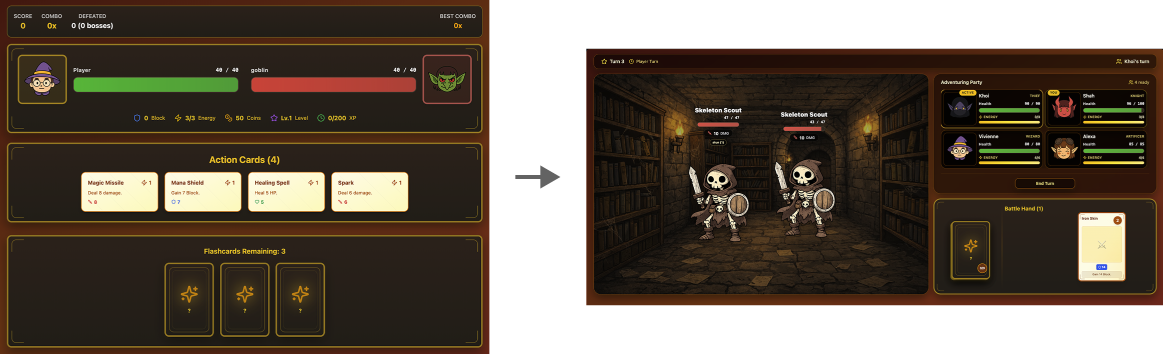
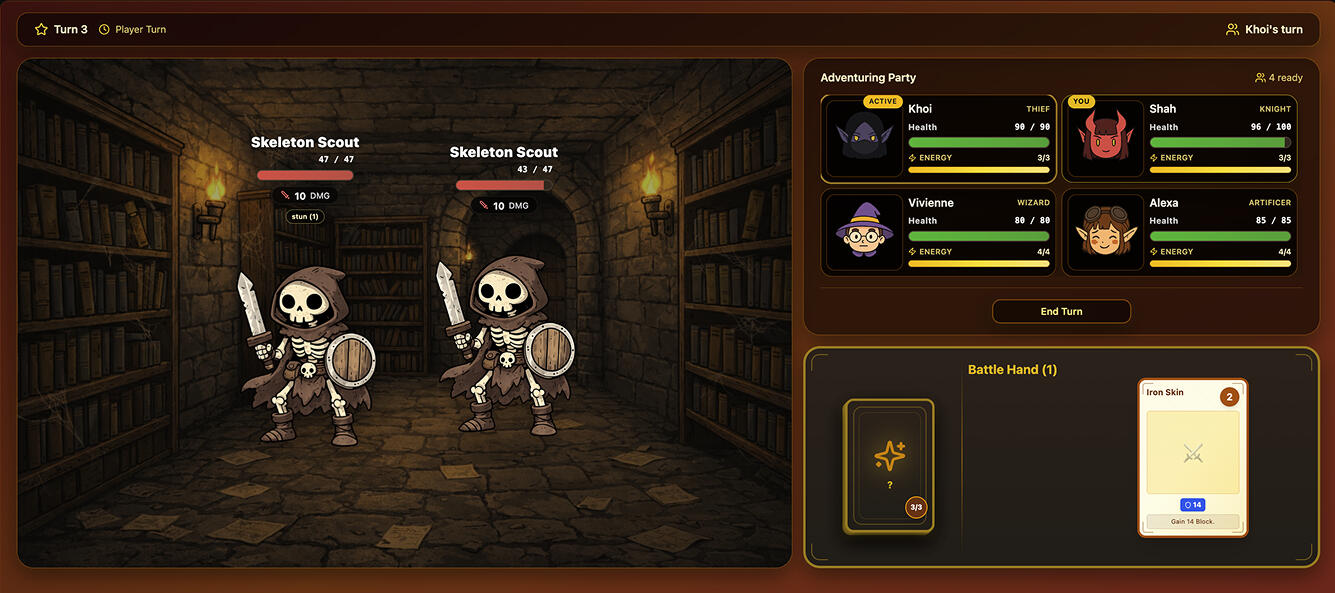
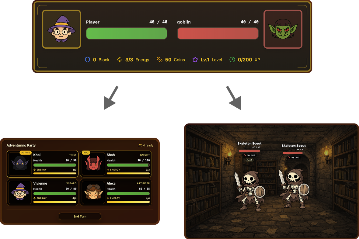
Our battle UI before and after this redesign
Key Changes Made
Design Highlight #1
Redesigned Presentation of Players' and Enemies' Information
In the first version, allies and enemies took up a lot of space. Thus, having multiple allies and enemies would have led to a crowded screen.This new design ensures that key battle information for all allies and enemies can be clearly seen at all times. This means users won't have to scroll to view all key battle-related information.
The allies and enemies displays were edited to take up less space, to allow users to see multiple allies and enemies at once
The deck-like representation of the flashcards in the new screen (on the left) suggests its in-game function of giving players more cards for their battle hand
Design Highlight #2
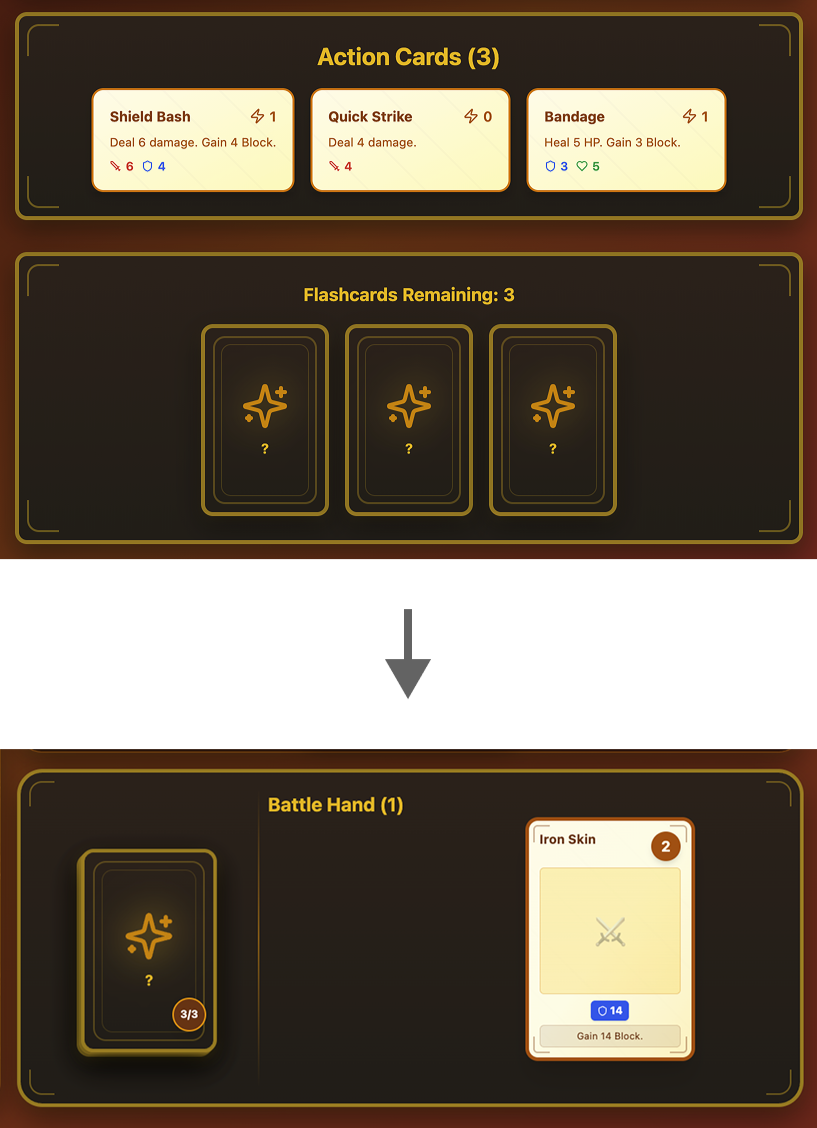
Revamped Flashcard Mechanic
In the first version, it wasn't apparent what the in-game benefits of answering flashcards (shown at the bottom of the first screen) were.In the new version, the flashcard label has been removed. Instead, flashcards show up as a deck; this imagery conveys that clicking on this deck will give players a new action card (after they answer the question that pops up).
Next Steps
We are constantly looking for ways to improve Ludera, which is why we'll be doing the following:
Running usability testing sessions (on mobile and desktop) to identify any room for improvement
Ensuring alignment between the visual design of the UI and marketing materials, to strengthen Ludera's visual brand
View Other Cases
Providing Answers to People with Chronic Illnesses

Centralizing Applications for Daycares

Helping Shoppers Find the Deals They Want
Designed for a class at the University of Toronto
Dish is a mobile app that helps young adults save money when grocery shopping.This project was created for the Fundamentals of UX Design class, taught at the University of Toronto.Dish was designed by a team of 6 UX design students.
My Responsibilities:
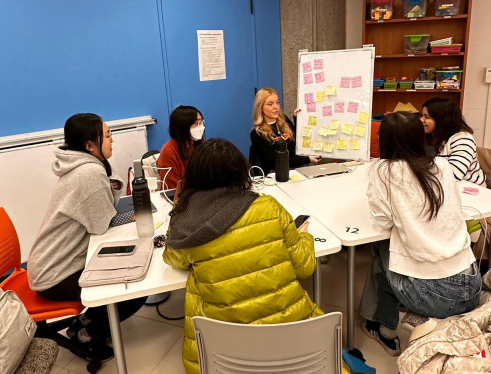
Organized a Team of UX Designers
Wrote and Distributed Surveys
Conducted Interviews
Used Research to Create a Persona
Created Low and Medium-Fidelity Wireframes
Research
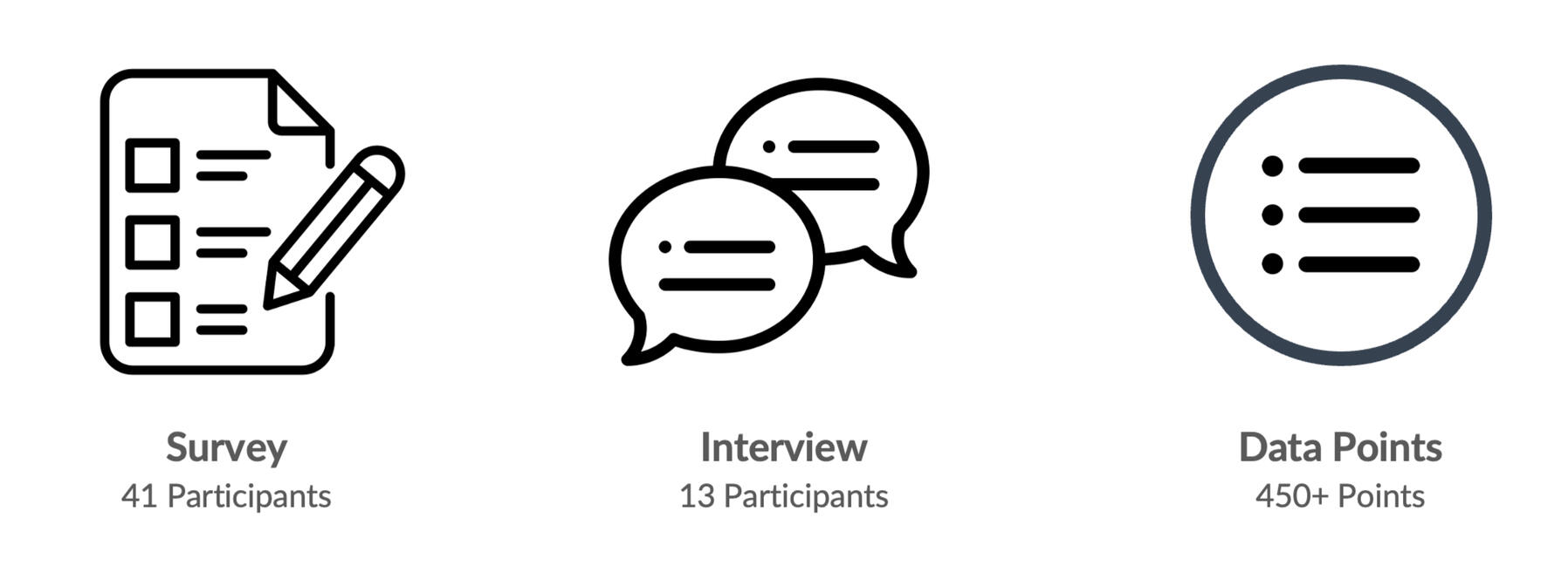
We collected data from secondary research, 41 survey responses, and 13 interviews, for this project.We learned that customers want to use deals to save money, but the deals they find are often either for products they are not interested in, or for stores that are out of the way.We used this data to create our persona, Sam the Shopper, who represents our core audience.
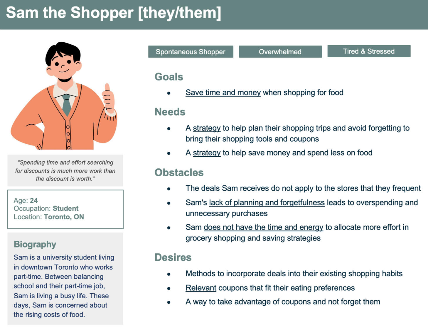
Our persona, Sam the Shopper, is a busy university student living in the GTA, who is worried about their grocery bill. They are interested in using deals and coupons, but don’t want to go out of their way to find or redeem them.Many deals they find just don’t appeal to them. And when they find coupons they want to use, they tend to forget them at home.
Ideation
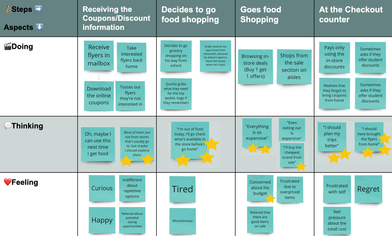
Sam's Present User Journey
To figure out the direction our app should take, we further defined Sam’s needs and wants. We plotted out their present user journey, to identify pain points that can be targeted.We then ideated on solutions that could address these pain points.
For our app, we decided to focus on the following ideas:
Location-based reminders, to alert Sam if coupons could be used at nearby stores
A rewards system, to help Sam build a habit of using coupons to save more.
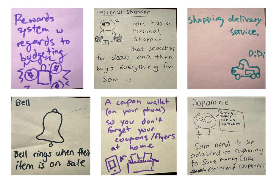
Some of the ideas we came up with.
Prototyping
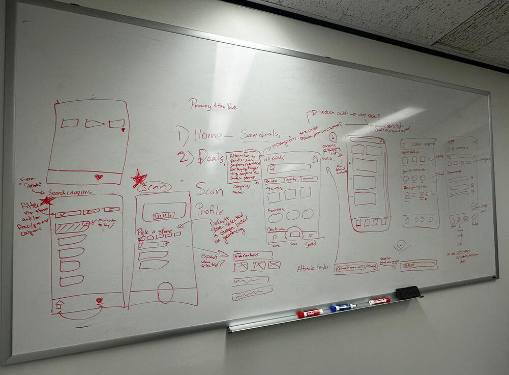
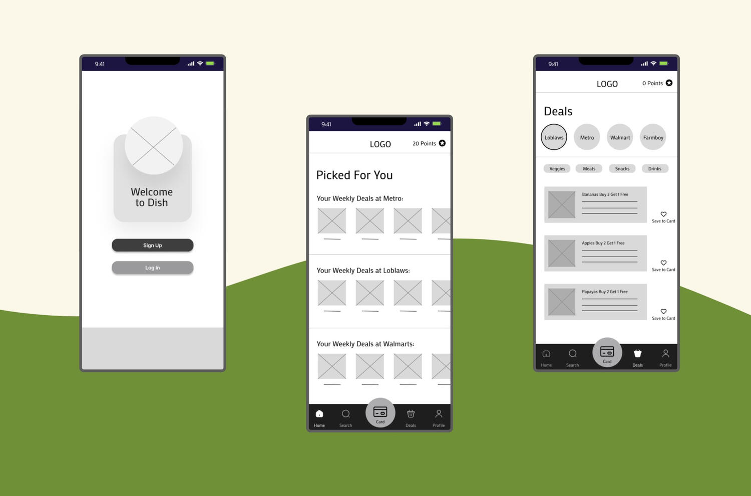
Using these two ideas, as well as Sam's needs and wants, we designed our product.We designed Dish, an app that suggests coupons based on a user’s favorited items, their past activity on the app, and their location. The user can also search for coupons by store or by item. These coupons can be saved to the app’s electronic card, and applied when this card is scanned.When a user is near a store, they will receive a notification asking them if they want to view coupons for that store.To further incentivize app usage, users can also gain points after using coupons at stores, which may be redeemed for rewards such as cash vouchers.
Using this concept, we made paper low-fidelity wireframes, and conducted lean evaluations to ensure that this product met the needs of our users.
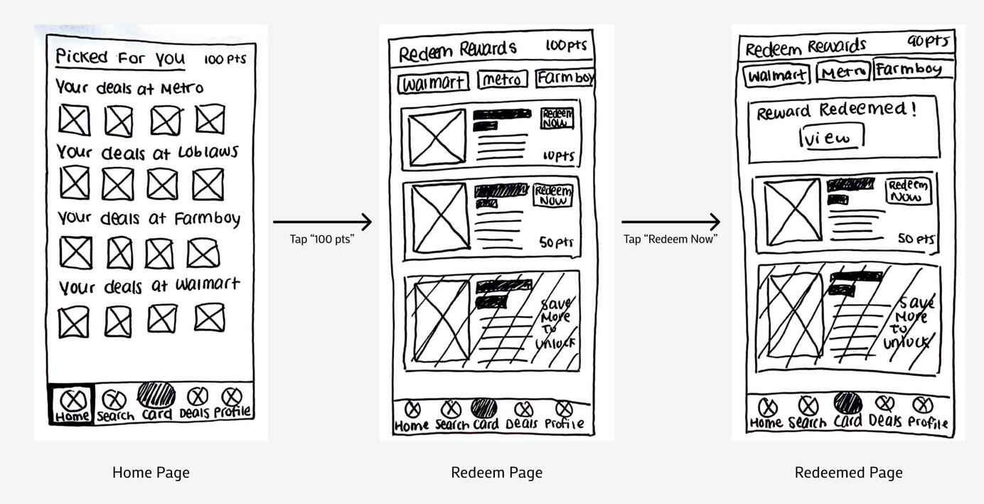
We gathered feedback from these evaluations, and used them to polish our medium-fidelity wireframes, which were made in Figma.


This medium-fidelity prototype can be accessed here
Lessons Learned
This project has taught me a lot, and allowed me to refine my design skills. However, these were the most important lessons that I learned:
How to present to stakeholders in an effective and memorable manner
How to collaborate with other UX designers, in a way that enables everyone in the team to utilize their strengths
View Other Cases
Improving Elections Ontario's App and Website

Centralizing Applications for Daycares

Assisting Students in Creating Exercise Routines
Designed for a class at the University of Toronto
About
Many university students understand the importance of exercise, but fail to meet their exercise goals. This project aimed to discover the reasons for this discrepancy, and identify strategies to help students exercise regularly.At the end of this project, 6 guidelines were produced for a hypothetical app that would encourage users to exercise regularly.This project was created for a UX research class, held at the University of Toronto.
My Responsibilities
Writing study questions
Conducting interviews and diary studies
Analyzing data via affinity diagrams
Formulating design guidelines
Methods Utilized
Semi-Structured Interviews
Diary Studies
Affinity Diagrams
Study 1: Interviews
To explore the topic of exercise in university students, one round of semi-structured interviews was conducted. Through these interviews, we aimed to answer the following research questions:
What difficulties do students face in developing an exercise routine?
What actions do students currently take to form an exercise routine?
A group of 10 participants, consisting of undergraduate and graduate students aged 18-26, were recruited for this study.
Key Interview Findings
In the interviews, participants identified 4 barriers to exercise and 3 strategies to combat these barriers
Barriers to Exercise:
Busy schedules that often fluctuated
Stress which led to demotivation
Lack of knowledge regarding exercises
Financial barriers to purchasing gym memberships and equipment
Strategies for Exercise:
University resources such as free gym facilities and classes
Resources on social media such as fitness influencers and videos
Gym buddies, or friends to exercise with
However, participants faced difficulties in implementing these strategies.
These issues included poor equipment availability, an inability to find exercise guides tailored to their skill level, and an inability to find suitable gym buddies.
Study 2: Diary Studies
Once the major barriers and strategies for exercise were identified, we wanted to further explore students’ interactions with these barriers. To capture how university students responded to these barriers, and confirm the conclusions of the interviews, a diary study was performed.
The diary study was formatted to answer the following research questions:
What barriers to exercise do students frequently encounter?
What is the average student’s schedule?
The diary study was conducted over 9 days. The study sample consisted of 5 participants, who were undergraduate and graduate students who ranged in age from 22 – 26 years old.
Key Diary Study Findings
In the diary studies, 3 factors that impacted students' exercise habits were identified.
Schedules
Energy levels
Social factors
Similar to the interviews, busy schedules were identified as a major barrier to exercise. Low energy levels, linked to busy schedules, were also stated to be a barrier. Social factors encouraged exercise for 2 of the 5 participants, but discouraged exercise for one participant.
Design Guidelines
Using the data gathered from these two studies, six design guidelines were created. These guidelines would guide the creation of a hypothetical app that would help university students exercise regularly.
This app would prompt users to exercise, and suggest exercises when opened. During the user onboarding, the app would users to input their schedules, so that the app would know when the user is busy.
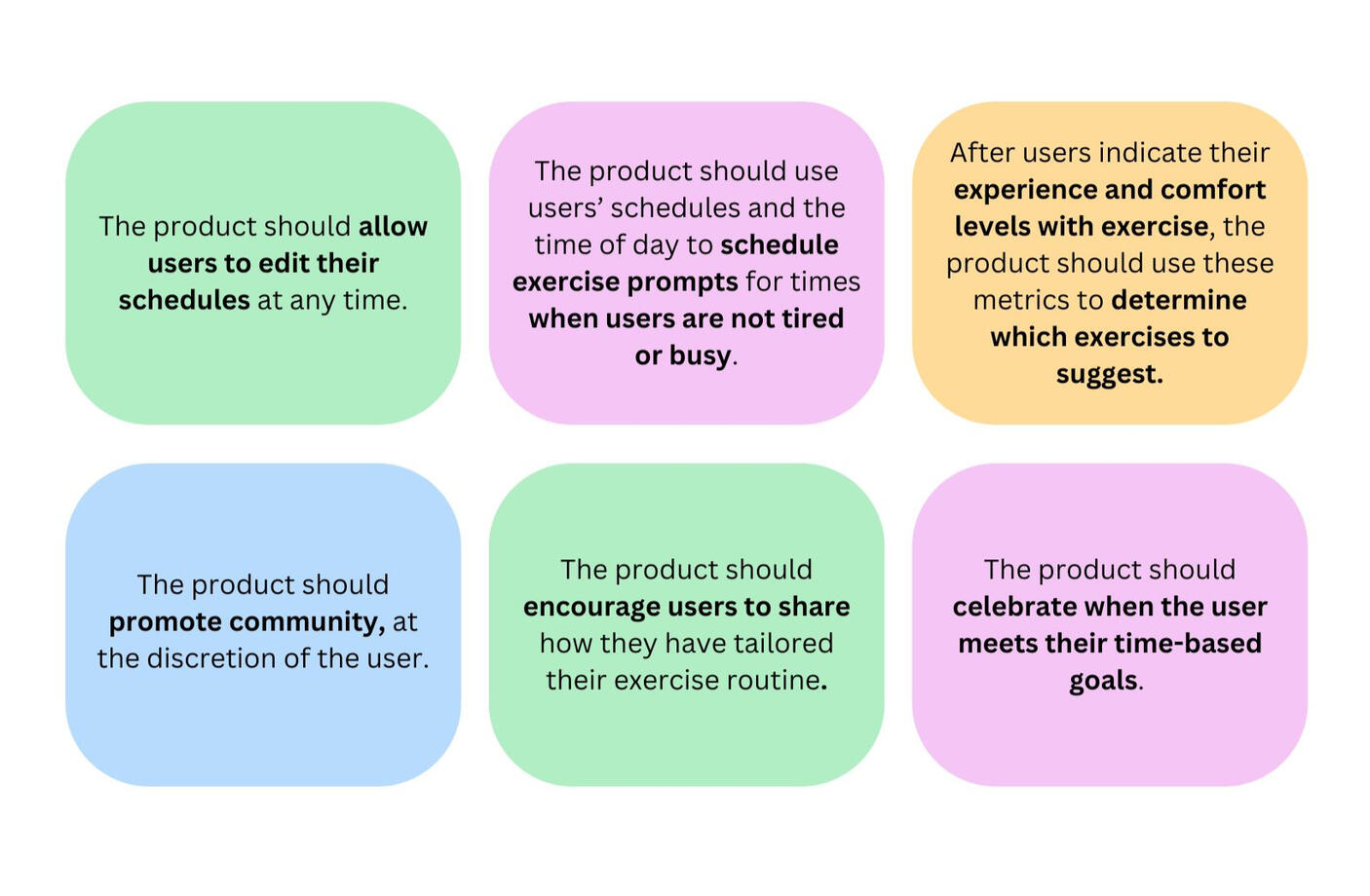
Our Design Guidelines
The product should allow users to edit their schedules at any time.
The product should use users’ schedules and the time of day to schedule exercise prompts for times when users are not tired or busy.
After users indicate their experience and comfort levels with exercise, the product should use these metrics to determine which exercises to suggest.
The product should promote community, at the discretion of the user.
The product should encourage users to share how they have tailored their exercise routines.
The product should celebrate when users meet their time-based goals.
Lessons Learned
Participating in this project has improved my ability to choose the best research methods for each scenario, and utilize each method effectively.
This project has also taught me the following skills:
How to analyze data in a group setting.
How to transform data into effective guidelines for designers
View Other Cases

Helping Shoppers Find the Deals They Want

Centralizing Applications for Daycares

About Me
Hello! I’m a UX designer who's interested in making the world a better place. I recently graduated from the University of Toronto with a Masters in UX Design, but started my UX journey with volunteer projects.I'm currently learning more about graphic design and programming to further support my UX skills. In my spare time, I enjoy listening to music, reading books, and practising photography.